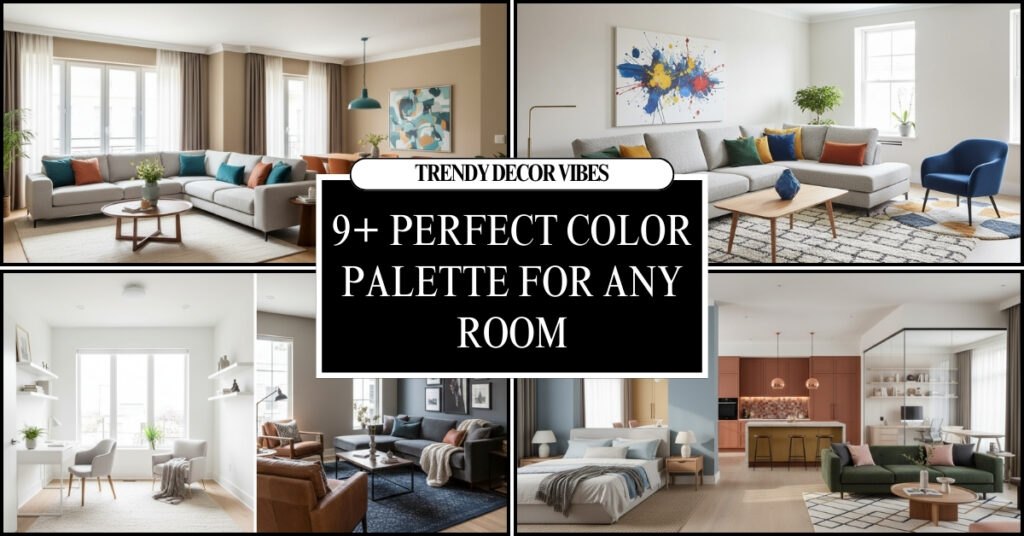
How to Choose the Perfect Color Palette for Any Room is one of the most critical decisions in interior design. Colors define the mood, affect the perception of space, influence lighting, and even impact mental state. The perfect color palette for any room ensures harmony, visual balance, and comfort while complementing your personal style. A poorly chosen palette can make a beautiful space feel cramped, chaotic, or disconnected.
This guide offers 10 detailed, actionable strategies for selecting the perfect color palette for any room. Each heading explores practical steps from analyzing light and room function to selecting accent colors and testing samples so you can create cohesive, inviting, and aesthetically appealing spaces.

Wall Art Beige Orange Bohemian Line Wall Decor Pictures
- wall Art Decor
- Bedroom
- Art Print
- Landscape

Wall Art Abstract Neutral Tones Minimalist Earthy Color Palette
- Portrait
- Art Print
- 16″ x 24″ x 2 Panels
- Living Room

White and Grey Canvas Wall Art Set of 3 Abstract
- Bedroom
- Landscape
- Gray Gold
- 24″L x 16″W
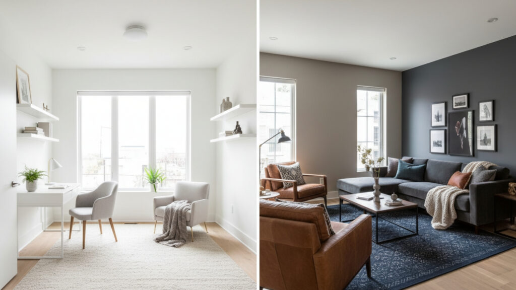
1. Understand The Room’s Purpose Before Choosing Colors
Every room serves a unique function, and the color palette should enhance its purpose. For instance, bedrooms benefit from calming, muted tones that promote rest, while kitchens and dining areas thrive with warm, energetic hues that encourage conversation and activity. Living rooms often need versatile colors that create both comfort and style, while home offices perform best with neutral shades that increase focus and productivity.
Choosing colors without considering the room’s function risks a disconnect between design and comfort. Even aesthetically beautiful shades may feel inappropriate if they do not align with how the space is used. Always start by defining the purpose of the room before selecting your palette to ensure both practicality and style.
Explore More Ideas: 6 Stylish and Modern Living Room With interior Design
2. Analyze Natural and Artificial Lighting for Color Accuracy
Lighting dramatically changes how colors appear. Natural light shifts throughout the day, affecting color perception. North-facing rooms often appear cooler and may benefit from warm tones, while south-facing rooms can handle cooler shades without feeling gloomy. Artificial lighting further alters color appearance, making it important to test samples under both types of light.
The interplay of light with wall color, furniture, and flooring also affects mood. For example, glossy surfaces reflect more light, enhancing bright tones, while matte finishes absorb light, softening bold shades. Carefully analyzing light ensures your chosen palette looks consistent and comfortable at any time of day.
3. Start With a Dominant Base Color for Stability
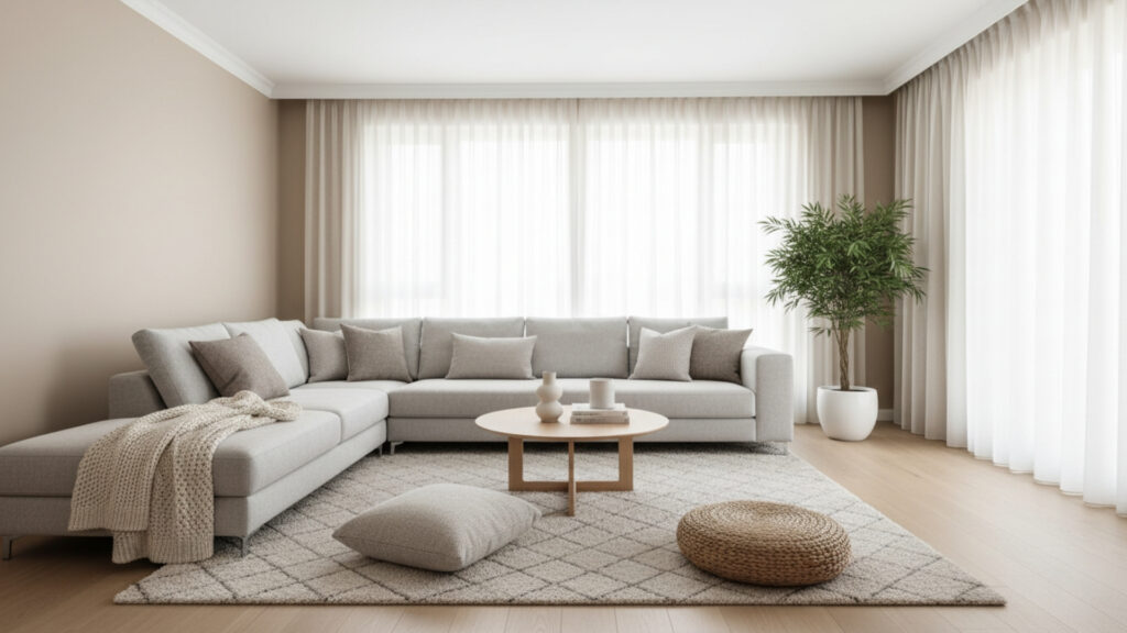
A dominant base color is the foundation of a room’s palette and sets the tone for all other choices. Neutral shades like warm white, beige, or soft gray offer flexibility and a timeless aesthetic. These colors provide a clean canvas that works with various furniture styles, textiles, and décor elements, making future updates simple.
The base color also affects the perception of space and cohesion. Large expanses of a single dominant shade create visual stability, while subtle variations in undertone enhance depth without cluttering the design. Choosing the right base color ensures your room feels harmonious and balanced.
4. Apply the 60-30-10 Rule for Perfect Color Distribution
The 60-30-10 rule is essential for creating a balanced palette. Sixty percent of the room should be the dominant base color, thirty percent a secondary color (such as furniture or walls), and ten percent an accent for visual interest. This distribution prevents overwhelming or unbalanced interiors.
Using this approach ensures each color has a purpose. Dominant shades provide cohesion, secondary tones support design depth, and accent colors draw attention to features like cushions, artwork, or architectural details. Following this principle helps create a professional, cohesive look in any space.
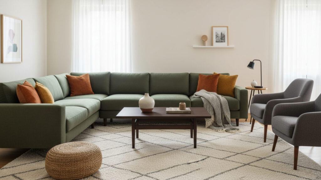
5. Understand Complementary and Analogous Color Relationships
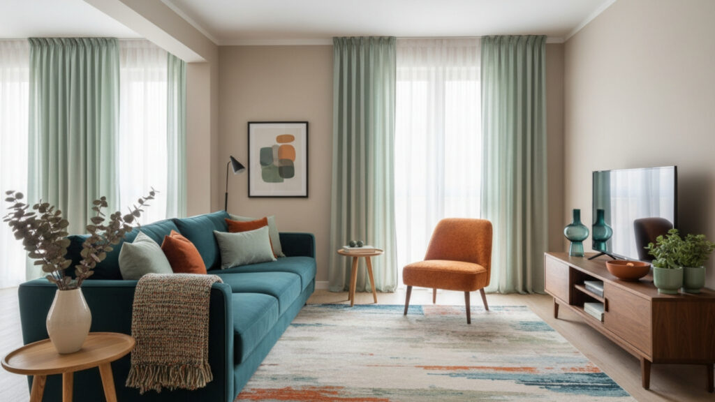
Complementary colors, positioned opposite each other on the color wheel, create vibrant contrast and energy. For example, pairing teal with burnt orange or deep blue with soft peach adds visual excitement while remaining harmonious if used sparingly. Analogous colors, which sit next to each other on the color wheel, produce a more subtle, serene effect, such as soft green with mint or turquoise.
Knowing these relationships allows you to create intentional palettes rather than relying on guesswork. For instance, using complementary colors for accents while keeping a neutral base avoids visual chaos, while analogous combinations create flow and continuity in spaces designed for relaxation or cohesion.
6. Consider Room Size When Selecting Light or Dark Colors
Colors have a strong psychological impact on perceived space. Light shades reflect more light, making rooms feel larger, open, and airy. Darker shades absorb light, creating a cozy, intimate atmosphere but potentially making smaller spaces feel cramped.
Strategically using dark accent walls in larger rooms or applying light colors to ceilings and walls in compact areas can dramatically improve spatial perception. Understanding the relationship between color and room size ensures the palette enhances rather than diminishes the room’s natural proportions.
7. Coordinate Colors With Existing Furniture and Materials
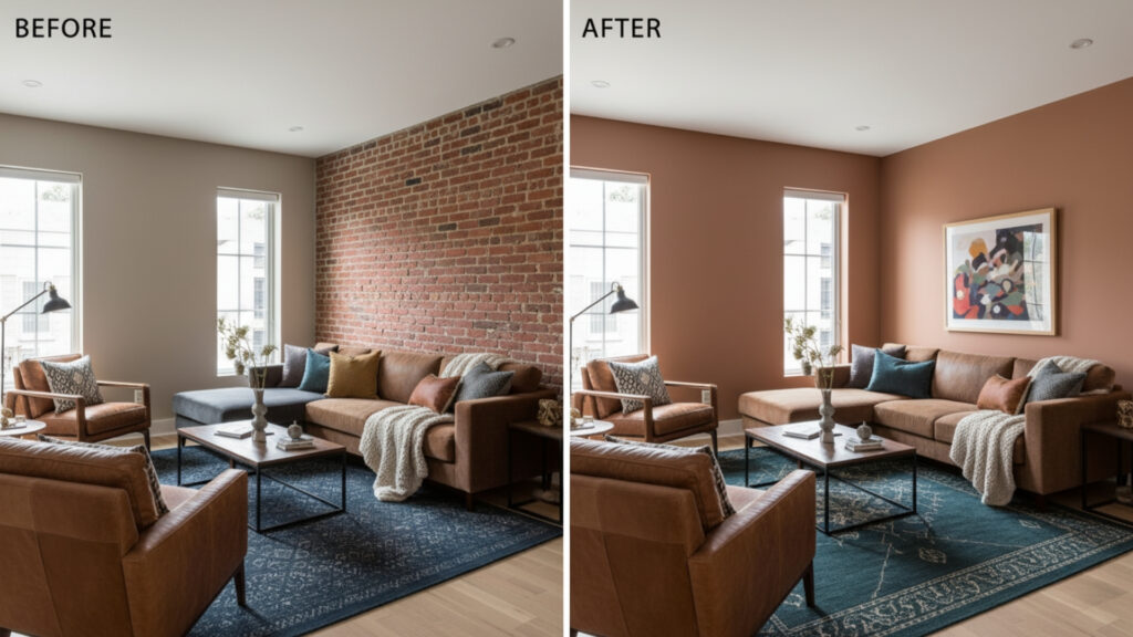
Existing elements like flooring, cabinetry, countertops, and furniture pieces affect how your palette will look. Warm wood tones pair beautifully with warm neutral shades, while cool grays and whites complement contemporary or industrial furnishings. Ignoring these fixed elements can result in discordant color schemes that clash with the room’s architecture.
Before finalizing colors, analyze undertones in fabrics, flooring, and finishes. This ensures consistency and cohesion. For example, a taupe wall might appear yellow against cherry wood furniture but harmonious with walnut or oak. Coordination ensures your palette works with both new and existing pieces.
8. Use Accent Colors Strategically to Add Personality
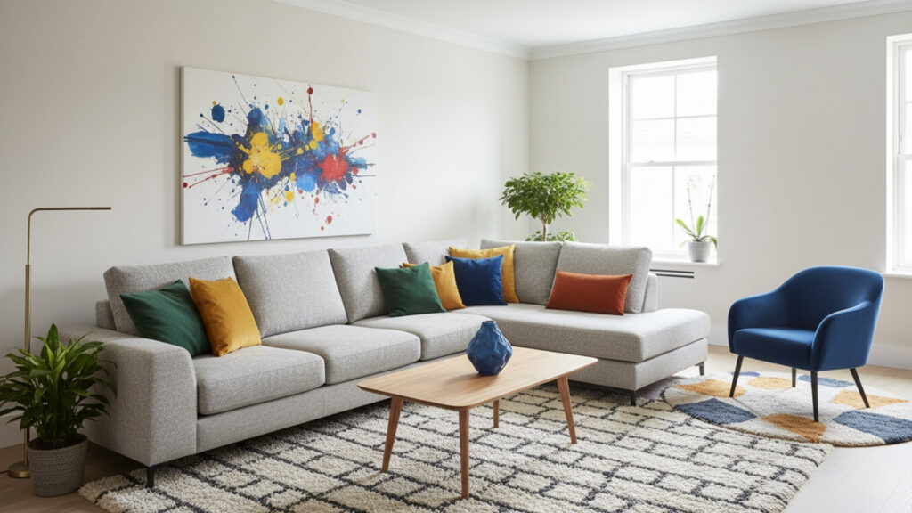
Accent colors bring energy and personal expression into a room. These shades should be applied in smaller doses through artwork, cushions, rugs, or decorative objects to avoid overwhelming the space. Choosing bold accent colors alongside a neutral base adds depth without clutter.
Layering accent colors consistently throughout the room creates visual continuity. Limiting accents to one or two shades maintains focus and sophistication while allowing your design to reflect personality. Accent colors are the key to turning a simple palette into a dynamic, styled environment.
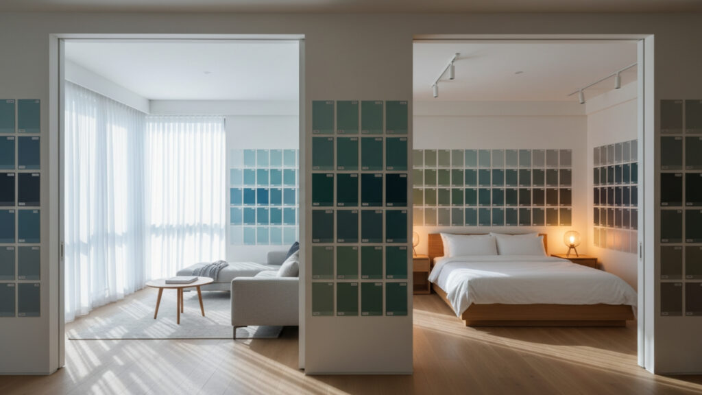
9. Test Paint Samples Before Committing to Full Colors
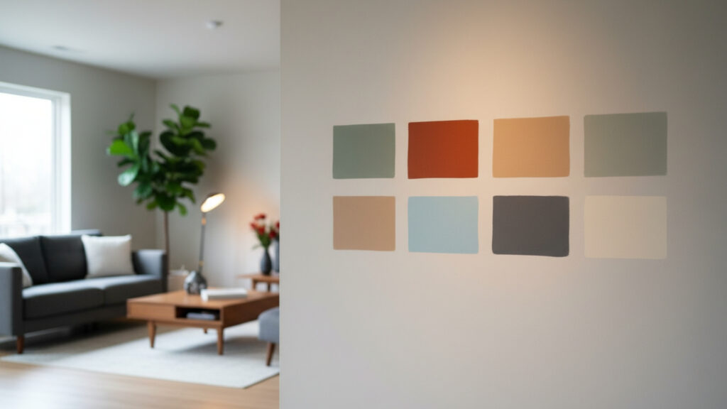
Paint swatches on a small card cannot fully represent how a color will look on large walls. Test samples directly on the wall in multiple lighting conditions before making final decisions. This step prevents costly mistakes and ensures satisfaction with your choice.
Observing how the paint interacts with furniture, flooring, and décor highlights undertones and ensures cohesion. Taking time to test also provides confidence in your palette and guarantees the colors enhance the room as intended.
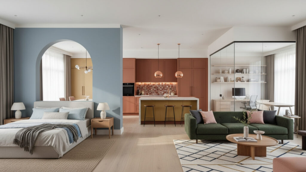
10. Ensure Color Flow Between Connected Rooms for Cohesion
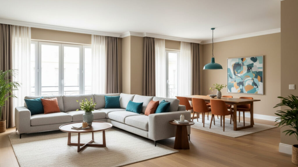
In open-plan homes, the perfect color palette for any room must maintain flow between spaces. Using shades from the same color family or repeating accent tones creates a sense of continuity without monotony. Each room should have a distinct identity while feeling part of a cohesive whole.
This strategy ensures your home feels intentional and visually harmonious. Thoughtful transitions prevent jarring changes in color and make moving from room to room feel seamless and aesthetically pleasing.
Summary: How to Choose the Perfect Color Palette for Any Room
How to Choose the Perfect Color Palette for Any Room involves careful consideration of room function, lighting, space, furniture, and personal style. By starting with a dominant base color, applying the 60-30-10 rule, coordinating with existing materials, and strategically using accent colors, you create a harmonious, inviting space. Testing samples and ensuring color flow across rooms further guarantees balance, cohesion, and timeless beauty. When executed thoughtfully, color transforms your interiors into functional, stylish, and personalized environments.

