
Cozy Bedroom Color Schemes is the emotional language of interiors: it sets mood, affects perceived size and light, and guides material and accessory choices. Designing a truly cozy bedroom is more than picking a “pretty” paint swatch; it’s about creating a layered, sensory environment where color works with texture, light, and proportion to support sleep, relaxation, and personal expression. Below are eight comprehensive color schemes with clear reasons why they work, how to combine materials and lighting, and step-by-step tips for painting, upholstering, and accessorizing so your bedroom becomes a serene retreat.
Each section includes practical palette pairings, furniture and fabric suggestions, and small-budget or DIY options so you can apply the idea whether you’re renovating or simply redecorating. Read each carefully; the nuance of tone, undertone, and contrast will make the difference between a passable room and a restorative sanctuary.

LED Candles with Timer 5 Pc Flickering Flameless
- Flameless Candle
- Bulb Base E5
- 2.3″D x 2.3″W x 7″H
- Material Acrylic

Rainbow Ribbon Bow Tie Queen Bedspread Set
- Bedspread
- Size Queen
- Color Orange, Pink
- Style Abstract

Lightweight Bedding Set with Quilt Cover & Pillowcases
- Fabric Nullify
- Color Blue Red
- 173*218 cm
- Video Gamer
1. Soft Beige and Warm Creams for a Calm, Hotel-Like Atmosphere

Soft beige and warm cream create a foundationally soothing environment because they mimic natural light and skin tones, producing an instinctive feeling of safety and comfort. To use this palette effectively, choose a dominant warm cream for large surfaces (walls, ceiling) and layer with slightly darker beige on architectural trims or the headboard wall. The key is subtle contrast: avoid stark white against warm creams, which can jar the palette; instead, select a soft white with warm undertones for trim. This base palette reads luxurious when combined with tactile materials, Belgian linen bedding, a lightly napped wool rug, and matte-wood bedside tables.
Practical styling tips: introduce low-contrast patterns (tone-on-tone stripes or a soft herringbone) to add depth without visual noise. For lighting, prefer warm 2700K LEDs in layered fixtures, a central pendant for general light, and soft wall sconces for bedside warmth. Hardware in aged brass or soft gold reads especially elegant against these tones. If budget is limited, swap in textured throws, an affordable woven headboard, or secondhand wooden furniture refinished in a warm stain; these tactile layers instantly elevate the calming beige base into a boutique-hotel-level sanctuary.
2. Muted Sage Green Paired with Clay Accents for Natural Calm
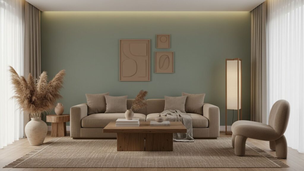
Muted sage green is a restful mid-tone that channels the restorative energy of plants without feeling overtly “greenhouse-y.” Use sage as an accent wall behind the bed or on cabinetry to anchor the room; its softness harmonizes with neutral bedding and natural wood. Pair sage with terra-cotta or clay accents (pots, lamp bases, accent pillows) to add subtle warmth and an earthen counterpoint that prevents sage from feeling cold. For textiles, choose linen and cotton blends, linen curtains, a cotton duvet, and a jute runner to reinforce the organic story.
How to layer: keep larger, reflective surfaces light (ceilings, doors) to avoid a cave-like feeling; introduce mid-tone wood (oak or walnut with matte finishes) and matte ceramic accessories. Plants are optional, but effective low-light species such as snake plants or pothos complement sage palettes while improving air quality. For a DIY-friendly update, paint only the bed alcove or dresser in sage, then add clay-colored cushions and thrifted pottery painted in terracotta glaze for an authentic, curated feel without costly purchases.
3. Deep Navy and Warm Neutrals for a Cocoon-Like, Intimate Space
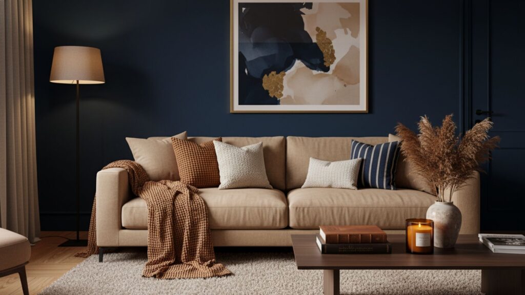
Deep navy is a dramatic but surprisingly comforting choice when balanced with warm neutrals and layered lighting. Use navy as a primary wall color for a cocooning effect. This works particularly well in rooms with moderate to low natural light because the result feels protective, not oppressive. Counterbalance navy with bedding and curtains in warm beige, oatmeal, or sand to lift the space. Add metallic accents, brass bedside lamps, and an antique brass mirror to introduce sparkle without harshness.
Acoustic and psychological benefits: darker walls reduce perceived reflective glare and help the eye relax before sleep. For a harmonious scheme, pick a navy with soft black undertones (not blue-violet) to avoid color shifting under warm bulbs. Upholstered headboards in boucle or velvet soften the intensity and add tactile luxury. If you’re nervous about painting all walls, start with one navy wall behind the headboard, then test nighttime views to confirm the mood. Pair with warm wood floors and an off-white ceiling to keep the composition grounded and visually balanced.
Read More: Pink Accent Walls and Bold Bedroom Ideas
4. Terracotta, Warm Browns, and Natural Texture for Earthy Comfort
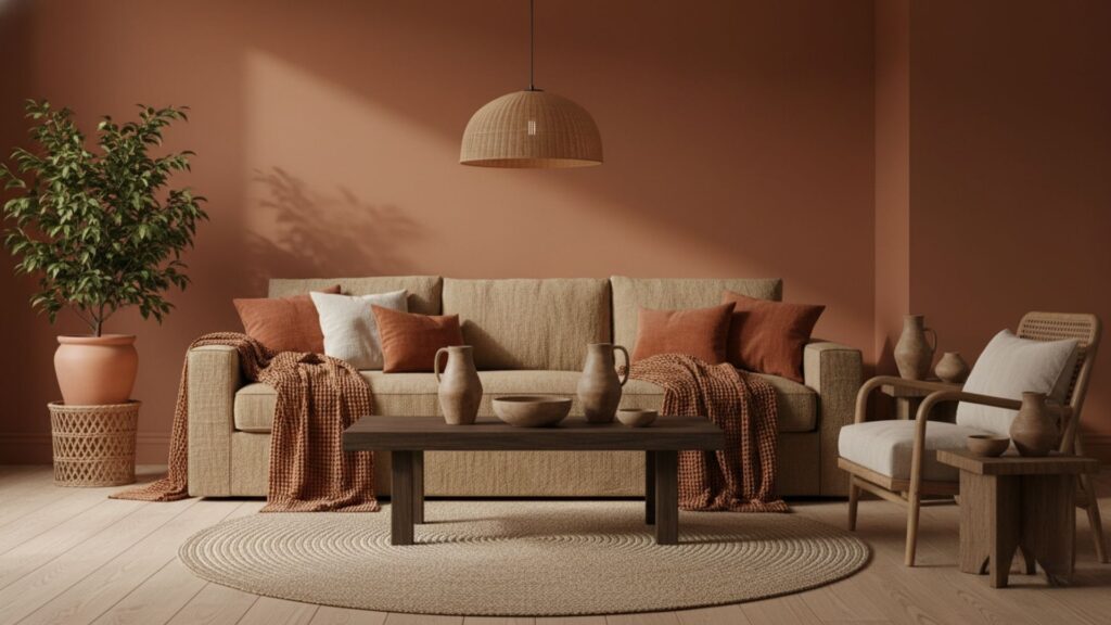
Terracotta and warm brown tones create an enveloping, grounded bedroom reminiscent of Mediterranean interiors, invoking sun-baked clay, leather, and woven textiles. This palette thrives on texture: plastered or matte walls, a leather bench, hand-thrown pottery, woven seagrass baskets, and a heavy cotton duvet. Terracotta is best used as an accent, a statement headboard wall, bedside lamp color, or set of throw pillows paired with warm mocha or camel neutrals on larger surfaces.
Practical pairing suggestions: combine terracotta and brown with soft whites for balance and introduce natural materials like cork, rattan, and reclaimed wood. Lighting should be warm and directional table lamps with linen shades, and dimmers allow you to soften the rich palette for bedtime. If you prefer a subtler look, use terracotta in accessories and textiles rather than paint; removable elements like cushions and rugs let you test the intensity without committing to a permanent color.
5. Blush Rose and Muted Pinks with Neutrals for Gentle Romance
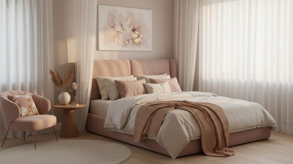
Blush rose and muted rose palettes are modern ways to create a soft, intimate atmosphere without feeling overtly feminine. The trick is restraint: use a dusty rose or blush as an accent, think upholstered headboard, throw pillows, or a soft linen duvet, while anchoring the room in a warm neutral base such as cream or greige. This combination reads sophisticated when mixed with matte brass or brushed gold hardware and low-sheen fabrics.
Styling and materials: textures like velvet or crushed silk heighten the gentle glamour of blush, while matte ceramics and unfinished woods prevent the scheme from becoming saccharine. Consider a layered approach: blush curtains softened by translucent sheers, blush-cued art pieces, and organic fibers for rugs to keep the room tactile. For renters, blush slipcovers, throw blankets, and affordable artwork are fast ways to test the palette before larger investments.
6. Calming Greys and Warm Whites for a Minimal Cozy Retreat
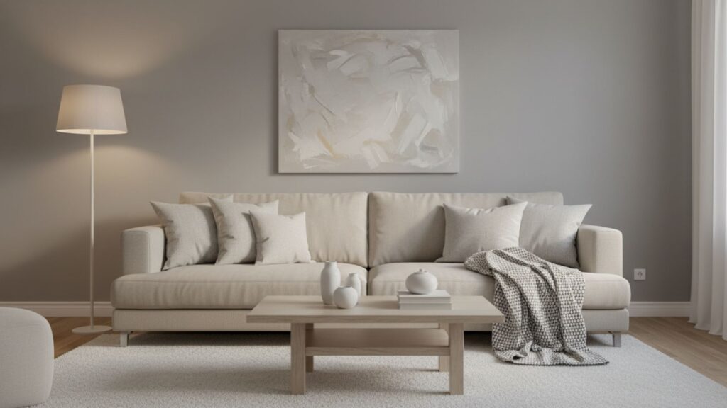
A grey-and-warm-white scheme achieves modern coziness when you select greys with warm undertones and pair them with creamy whites rather than bluish whites. Light-to-medium greys on walls provide a subtle visual anchor while warm white trim and bedding maintain brightness. This palette is ideal for lovers of minimalist design who still crave softness and warmth add interest via texture rather than color: boucle cushions, a soft wool throw, a plush area rug, and matte-finished wood accents.
Design details matter: choose layered lighting, recessed or pendant overheads for ambient light, bedside lamps for reading, and wall-wash lighting to create depth. Inject small pops of tone through natural wood, tan leather, or muted green plants to avoid monotony. For an economical refresh, repaint walls and replace textile accessories, pillows, duvet covers, and curtains with warm white and greyscape options to transform the room gradually.
7. Moody Charcoal with Soft Contrast for Dramatic, Restful Spaces
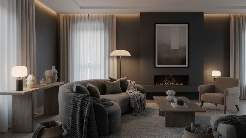
Charcoal and deep graphite tones create a modern, luxurious cocoon that signals rest; used thoughtfully, this palette reads sophisticated rather than gloomy. Apply charcoal on a single focal wall, a low-slung headboard, or built-in storage façades, and keep bedding and floors in warm neutrals to soften the drama. Textures like velvet, knit throws, and brushed metal accents help the charcoal feel tactile and approachable.
Lighting and balance are essential: rely on warm, dimmable light sources and reflective accents (mirrors with warm bronze frames, subtle metallic accessories) to prevent the space from closing in. For small rooms, avoid painting every wall charcoal; confining dark tones to defined areas keeps the restful value while retaining perceived spaciousness. This palette pairs beautifully with ochre or mustard accent pillows for a contemporary edge.
8. Warm Mustard, Honey, and Gold Accents for Cheerful Coziness
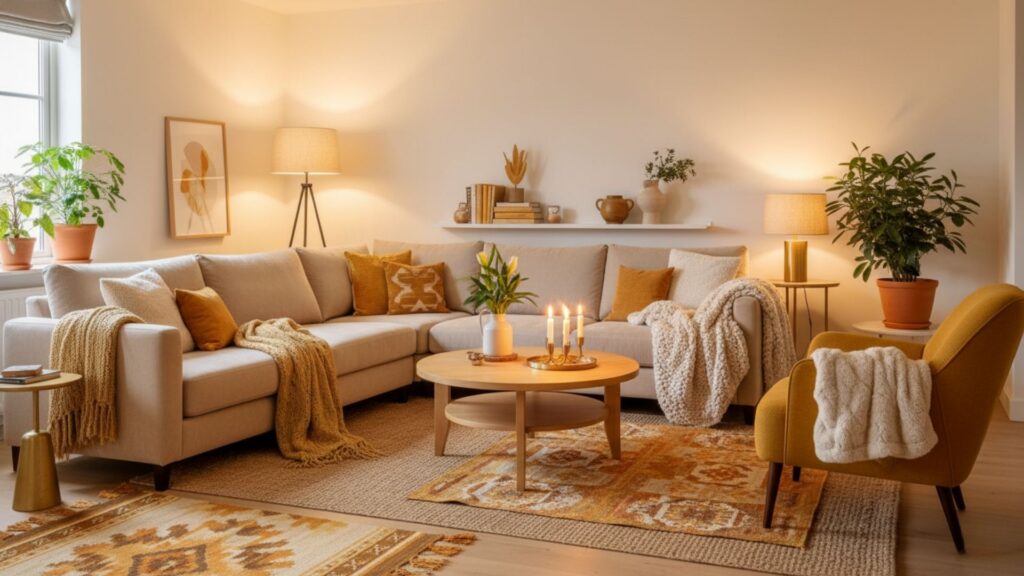
Warm mustard and honey tones bring optimism and comfort into bedrooms, colors that read lively yet grounded. Use these shades as accents: throw pillows, a bed runner, lampshades, or a statement armchair. Pair mustard with warm ivory walls and medium wood tones to keep the palette balanced. Gold or brass details (mirror frames, lamp bases) enhance the warm glow and add an upscale touch.
Styling guidance: when using saturated mustard, control saturation by combining it with muted textures, such as linen, cotton, and matte ceramics, to avoid visual heaviness. Introduce botanical greens or terracotta for a layered, earthy composition. For a small-budget update, swap in mustard-colored pillows and a cozy blanket to instantly warm the room without a major overhaul.
Summary
Cozy bedroom color schemes rely on warm tones, soft contrasts, natural hues, and calming shades to create a restful atmosphere. Whether you prefer earthy terracotta, serene sage green, deep navy, or delicate blush, each palette adds warmth and character to your space. With the right colors, textures, and décor, your bedroom can become a soothing retreat perfect for relaxation and comfort.